ACTIVE Packaging
ACTIVE’s packaging is where the rebrand became something you could hold.
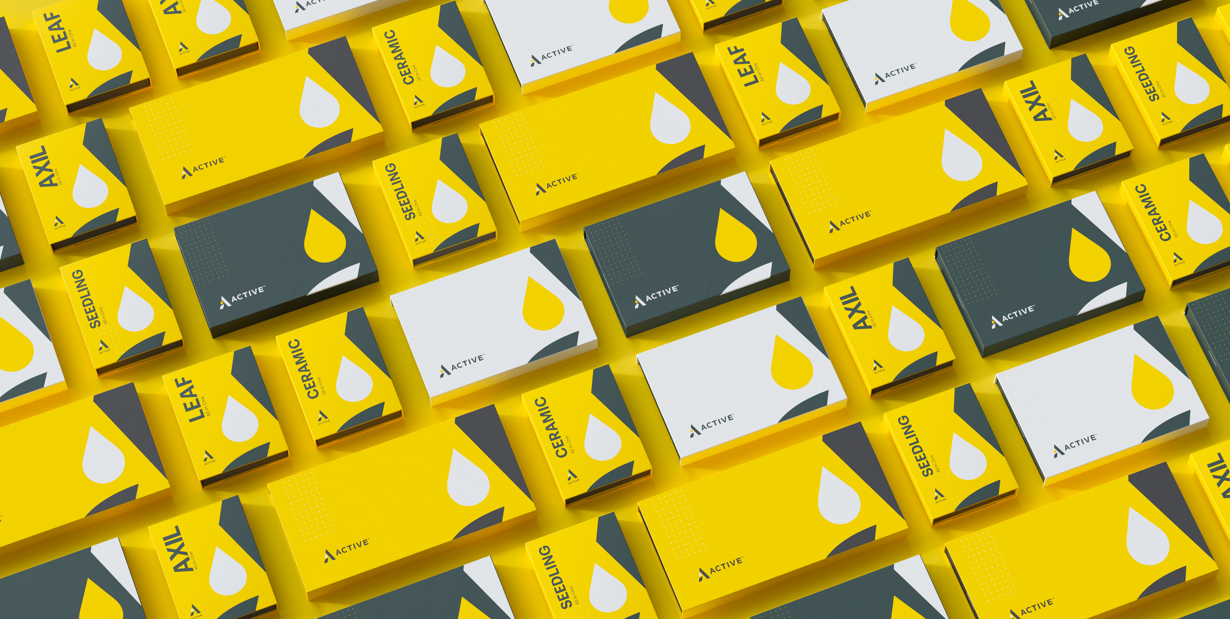
Coming out of the shift from AVD to ACTIVE, we went all-in on yellow so the lineup would be unmistakable in a crowded cannabis space. Big type, a cropped logo, and a simple graphic system stayed consistent across every SKU and sample box, so the range feels like one family even as it grows. The result is packaging that reads instantly on shelf and keeps building brand recognition through repetition.


Senior Graphic Designer: Steven Davis